

So last week in the plus segment, Mayo, we talked about some of my smart home and just general tech adventures as I've moved into the new house in Michigan. A couple pieces of unfortunate follow-up on those. So first, I said that I bought a HomePod, a full-size HomePod, to pair with another full-size HomePod with the Apple TV. So stereo pair, Apple TV HomePods. I noticed this week...
that that new HomePod that I bought, the screen or whatever you want to call it, the screen on the top, just doesn't light up. You know, it's meant to show... Like a little, not waveform, but like a little animation as something's playing. And obviously if you invoke the voice assistant, it's meant to light up. Just doesn't happen. It just stays black.
But if you tap it, it pauses or whatever? Yeah, if you tap it, it pauses, and if you hold down, it activates Siri or whatever, but no. Just no animation, no lights. I'm not running the beta or anything, so I assume this is a... hardware fault of some sort. Realistically, I don't care. Like I don't need the screen on the top to be showing me anything. The problem though is with a hardware fault, you know, one.
One defect this early highly suggests another defect that could be a bigger defect down the line. So I'm probably going to take it back to Best Buy and get it replaced. But yeah, I wouldn't want to risk there being like some security problem. Makes the speakers blow out in a month's time and then you're outside the return window and then it's a lot more painful to go through the warranty process. Exactly. If the screen's not turning on, I would...
Get that addressed. I do imagine, though, that someone else could have bought one just like that and they would never even realize that it was meant to light up. Because you could easily use that product and never worry about the dancing lights.
on the on the top of it my home pods that are attached to the tv what i hate about them is that they do permanently light up and attach the tv they always have the little like faint white glow when oh even if something's not even if something's not playing yeah so the old like the first gen home pods they had no uh glow they would just have the volume buttons be lit right
And I kind of preferred it that way around. On these ones, the volume buttons are like, I have the black HomePods. The volume buttons are like edge black. So the only way they're visible is if the system illuminates the panel. Which is why I think they shine that grey-white mush permanently, just so the plus and minus buttons, you can actually see them. Yeah.
But I mean, the visibility, that is one of the biggest regressions compared to the Gen 1 HomePods. The volume buttons are not well discerned. They're just, especially, it's not as bad on the white ones, but on the black ones, they're so... slight and you can barely pick them out i mean how often are you coming up to the home pod and manually pressing the button on the top anyway to change the volume pretty rarely but it still kind of annoys me that because they don't have the volume
buttons light up on their own now they have to permanently make the led array shine a color just so you can actually see them i kind of wish there was a setting to make them not do that because you're in the home theater mode, it's late at night, you know, you're watching a film, and to be fair, they do have ambient light sensor, so it does dim them pretty considerably when it's dark, but they're still on.
And it was like, I kind of wish you could just turn them off entirely and only have it like light up when you ask for a Siri request or something or you like physically tap it. So that does actually annoy me when the lights are working as intended. I don't think I've... ever use the volume buttons on top of a HomePod to control the volume. But when it does happen, it's always like somebody who's visiting us and they walk up to the HomePod and they're like...
how do you turn this thing up? How do you turn it down? And they're just like tapping on the top of the screen and then they inevitably pause it or activate Siri just because A, the buttons are hard to see and B, the touch targets are so...
small and close to the other touch targets on the top of the HomePod. Yeah, because if you tap anywhere... a few centimeters off it just starts playing and pausing right so yep it causes chaos i do my home pods in the living room like the right hand side one is quite close to the door that leads into the kitchen so on occasion if i'm like
sitting on the sofa and then i want to go to the kitchen i want to pause what's playing rather than you know finding the apple tv remote or using my voice as i'm walking out the room i might like tap it if you see what i mean so occasionally i use the tap gesture but i could live without it for sure Then the other piece of unfortunate follow-up is I talked about how I got the Acara G4 HomeKit Secure Video Doorbell. Just this morning, Acara announced the G410 HomeKit Secure Video Smart Doorbell.
So it is already outdated in the 12 days that I've had it. And I can live with that as like technology, you buy something and then you never know when the next version is going to come out, right? Except that I did know. 9to5Mac had the news under embargo. It had been mentioned in our Slack. There was a draft in WordPress talking about the Acara G410, and it just completely slipped my mind.
so i'm going to return the g4 and then order the g4 10 or get the g4 10 for review or something but had you already installed it on the door yeah but i just used like command strips basically i didn't actually mount it like with a with the screws or anything that's not terrible then so it'll be pretty easy to take down and return it's just just such as life with smart home stuff i guess but the good news is is in those
12 days or whatever, the G4 has been rock solid, like incredibly solid. I've had no problems. I opened the home app. It's right there. Somebody rings the doorbell. It pops up on my phone, on the Apple TV, on the HomePod. It chimes. For a battery powered HomeKit secure video doorbell, which I think this might be the only one, or maybe there's like another one out there, but this is definitely the most popular one and it's great. So hopefully the G4 10 is even better.
And you had Ring at the old rental, right? At the old rental, it came with a Ring system that was fine. And I had it rigged up with HomeKit through Home Assistant, I think. Or Homebridge, one or the other, I don't know. And it was fine, but this is significantly better because it's proper HomeKit secure video. I never have to use the Acara app. They don't try to upsell you on anything. It just works, which is...
Basically, the most important thing with smart home stuff is that it just works and you don't have to fiddle with it and worry about it. It works for Emily, too. She's not going to fiddle with it, so if somebody rings it and it doesn't work on her phone for some reason, the doorbell is just not going to get answered.
yeah i mean i use the eve outdoor cam so it's not a doorbell but it's the outdoor camera home kit secure video i really like oh yeah it's great i hear some complaints about it from people but i can't say i've had any issues with it almost ever like maybe once a year it loses connection you have to reboot it but
It's literally like once a year. And you're always in the middle of installing various betas on various things, so I'm never 100% sure if that's to blame. But honestly, the failure rate is so low, you forget about it, and it just works. The complaints I have with HomeKit Scare Video is more about... the home app um support for scheduling and stuff so like yeah certain times of the day i'd like it to be able to do to ignore me going outside to empty the bin or if it knows i'm at home disable
The alert that when I open the door to take the bin out, it then tells me I'm here because I already know I'm here. Obviously, it's a bit different with doorbells because they have a defined action, so you don't have to set them off to motion sensors the whole time. You can just do it only when they get physically pressed.
but obviously if you've just got an outdoor camera you can only really make sure it pops up based on motion and the controls that you have to adjust in the home app are not really fine grade enough to do what you want and you can't automate them so you can set up a manual schedule of be like you know when when the home app detects them at home don't record and do it when i leave um but you can't have it set to like
ideally you'd be able to integrate with the home kit automation stuff and have it so that you know when a motion sensor goes off in the hallway temporarily disable the trigger for the camera right so right yeah that means you're basically leaving the house right and just give it a minute a minute of freedom so you don't get
alerted as you shut the door that there's someone at the door which is yourself but the home app does not expose automation controls for any of that stuff it's only in this like separate menu where you have to do it manually so you can't integrate with other automations which is frustrating but
Aside from that, the actual just recording and, you know, alerting and the reliability is really, really strong. So I highly recommend HomeKit cameras. And it's included in Apple One too. So if you pay for that, you get HomeKit Secure Video. which it pained me to have to pay Ring $10 a month for recording from that doorbell. And then the G410, the Acara one, it looks like it adds 2K video. So instead of 1080p, it's 2K video.
It has dual-band Wi-Fi, which the current G4 does not, just uses 2.4 gigahertz. It can act as a matter hub, which is not really important to me. I guess it's nice to have. And then it has millimeter wave radar, which apparently it offers a big improvement in motion detection and people detection. Realistically, we'll see because I've had no problems with people detection on the G4.
And nine times out of 10 with a doorbell, the people it's detecting, they're just going to press the doorbell anyway. So we'll see how that works. But it's there. And if it makes it even a little bit better, it'll be worth it.
yeah millimeter wave detection for motion is legit but i think it makes more sense if you have like motion sensors in your kitchen and you want to have like smart lights activate based on motion because the millimeter wave is a lot more sensitive so i mean they even say it can detect like
the human breath you know your skin moving just from your breathing not quite sure it's down to that level but it is very accurate so like if you're over the other side of the room and you're doing like the dishes like washing up and you're not like actively moving around the millimeter wave detectors will still pick it up whereas an ir one might not
um so if you're if you're looking for like motion sensors inside the house and i think akara does a good one there's a few others out there uh the millimeter wave stuff is definitely worth looking into but for doorbell I'm not sure it would make that much of a difference in this game of things because the amount of motion that a door picks up is always going to be pretty big because it's people walking around straight up to the door or leaving the door. Unless you want to maybe detect like...
your cat from the other side of the the driveway or something like maybe then the millimeter wave would be better but yeah in general i don't think it's going to make that particular point make a huge difference to to your experience but the technology millimeter wave for motion sensing is definitely worth looking into if you need it in other contexts so yeah we'll follow up on that at some point in the future and other follow-up for this week we talked last week about the new eu
Policy changes in business terms for the App Store under the Digital Markets Act. We had read a Mastodon post from Steve Tratton-Smith at the time, basically giving his thoughts as a developer about Apple's latest terms. And we had interpreted his post as basically saying, the only way that Apple is in compliance with the DMA is a 0% commission. He reached out on Mastodon again to clarify.
exactly what he thinks about the EU competition stuff. And he said, 0% is one option, but another option is for Apple to spin its services into separate companies. and for those apps to have to pay the same tax as third parties to use the App Store. Or they could artificially inflate all their prices to simulate paying the tax they impose on third parties. Or Apple could discontinue their services entirely.
The DMA just demands that it's fair for third parties. And he continued, the longer this draws out, the more I think company breakup is going to be the only option since Apple can't be trusted to follow the law. Their recent App Store team reorganization and the Apple Games app might be baby steps towards that end. The App Store reorganization that he's talking about, I think, is...
Last summer, when the App Store VP at the time, Matt Fisher, departed the company, and then they promoted Carson Oliver to oversee the App Store team, while then App Store product director, Ann Tai. took over a dedicated alternative app distribution team. So it's more of a dichotomy between those two teams. And Antai, by the way, is the person that presented Apple Arcade in that 2019 event. The breakup path.
we definitely didn't cover very well on last week's episode because I'm very much on the case that, well, they're just negotiating the percentage until they had it all the way down to zero. The breakup thing is definitely a direction that might happen in the future, but I don't think it's a direction that Apple's going to... like proffer, they're not going to end these negotiations. They're not going to be like, well, you know.
We'll just break up the company into four separate companies rather than giving you an extra percentage. I think they'd rather negotiate on percentage, even though obviously they'd rather do nothing. But the breakup thing is the kind of thing that's going to be enforced on them by...
in my opinion rather than them suggesting it because half of apple services wouldn't survive if they're independent companies that's you know that's that's the secret truth and so they're not profitable they don't want to rush to like split it out and the only thing that really makes sense is if you had like
the app store is a standalone business really but then you know that gets incredibly messy and incredibly complicated very quickly so i don't think apple's going to want to volunteer that direction but stuff like the games app
does potentially show that maybe they could do carve-outs of things. And the other thing Stephen Tratton Smith said was that maybe his interpretation of the EU rules were like, well, if Apple's offering Apple Music to make it fair to... alternatives they should apple music should also pay the same fees that in-app purchase does and therefore everybody's paying the same so there's no difference in what apple pays can be what a third party pays therefore making it an even playing field
My interpretation, and who knows what is correct, and I'm not even sure you can ask lawyers and they know for sure, I think the DMA does mention that stuff, but it also just applies more widely to the entire app store, so it applies to stuff that Apple has no... fingers in fingers in of its own like games right you know i mean take apple arcade but like the game store you know epic games that just does in-app purchases of microtransactions just because apple doesn't do microtransactions for
its games i don't think excludes them from the purview of the quote-unquote free of charge line that you know that they would repeatedly quote with apple music versus spotify maybe you could end up in a situation where they negotiate and they have like Apple Music give 30% of its revenue to charity or something, you know, to like work out, to figure out a number. But again...
These are the kind of things that I feel like are real, real lost resorts and things that the government would impose on Apple as like, you must do this now to not be considered a noppy player. I think the Apple negotiations and all this are just going to be...
The best thing you can do is offer different variations of service fees and commissions. My initial interpretation of the games thing, I guess, was slightly pessimistic, which was the vast majority of App Store... revenue for apple comes from the games category so by spinning off games if at some point they were they were to do to use this as a way to offer alternative business terms between different categories of apps
This was a way to protect the App Store games revenue as a separate platform versus rolling it in with all of the other App Store changes that they're going to make. Because having to lower the App Store commission...
We've talked about it before, but if you lower the App Store commission, Apple's not necessarily losing a lot of money in a lot of cases because right now they're not getting any money from Spotify. They're not getting any money from Netflix. But if they have to lower the App Store commission in a way that affects games...
That's where they take the hit. So if one of their long-term regulatory plays is to spin off the games category of the App Store into something separate, that's probably their best bet to stave off some of those losses. So I don't know if that's a more pessimistic take on things and them just being an example of another example of them being greedy. And then it would allow them to be, quote unquote, more generous to other categories. I'm not entirely sure, but it definitely does.
lean towards what Steve Tratton-Smith suggests, which is some sort of breakup between whether it's Apple services or certain categories of apps. But also you still have to worry, like, let's say they did break off games into a completely separate entity. Are they going to be allowed to charge 30% just because it's a separate entity? It's still going to have a monopoly on the iOS games market, no? All right, in terms of distribution. So there's many overlapping factors here.
And it's not easily solved. This is literally a multi-year thing that moves at a glacial pace. But yeah, the breakup stuff might be the DOJ level stuff rather than the... tit for tat on the DMA interpretation stuff. The super, I don't know, the super pessimistic or super Apple being greedy interpretation of the games thing is that...
If they spin it off into something separate and the EU comes back and says, hey, the Digital Markets Act requires X, Y, and Z, or the United States DOJ comes back and says, hey, the App Store requires X, Y, and Z, Apple says, great, we can make those changes to the App Store. But Apple games, that's a completely separate thing. So it just kicks the can down the road for the game stuff and gives Apple five, 10 more years until regulation just for games is introduced.
So they can keep milking that for as long as possible. You have to assume that Apple's going to act as obstinate as possible at every single turn throughout all of this process. Is the game strategy... They're not going to do anything out of the kindness of their heart. And I think the game's breakup example seems like an example of Apple maybe trying to comply with the DMA, but I don't think it is.
Yeah, and obviously right now the games app has no... It still directs you to the app store to actually install your stuff, right? So it's just a user-facing feature that has the game overlay when you've got a controller attached. So it does improve the customer experience for people that are playing games on... Apple platforms but you can kind of see it as a bit of a hedge that if they have to they could put the store inside of the games app and the other piece of small
EU follow-up this week is that Apple has formally appealed that 500 million euro fine it received from the European Commission for violating the Digital Markets Act. That fine came in April.
And Apple made those changes to the App Store rules last week, covering things like steering and the ability for developers to direct users to alternative payment options. In its appeal and in a statement to... press apple said today we filed our appeal because we believe the european commission's decision and their unprecedented fine go far beyond what the law requires
As our appeal will show, the EC is mandating how we run our store, enforcing business terms which are confusing for developers and bad for users. We implemented this to avoid punitive daily fines and will share the facts with the court. About what we expected, and Apple specifically calls out some of the things they say the European Commission has made them do, one of which being breaking up the app store, the store services fee into multiple tiers.
So originally the store services fee was flat, same across the board. In this latest revision, they broke it up between tier one, which is 5% and tier two, which is 13% or 10% for small business program members. Apple specifically says that the EU mandated and dictated which feature should be included in which tier, specifically around mandating that Apple move app discovery features to the second tier. Apple also takes issue with the EU.
applying these anti-steering rules to not only links out to alternative payment methods, but also in-app alternative payment options and in-app web views. more of the same back and forth here i think yeah the the split tier stuff is like okay so the eu required you to offer different tiers with different price points but that was partly probably on you for wanting to charge
20% rate in the first instance, you know what I mean? So like, they were like, well, you got off for a second tier that's cheaper. So it's not, I don't think it's quite as black and white as how Apple presented it. And obviously with the steering thing, the drop-off rate...
for making a user go to a web browser to buy versus having the in-app sheet is going to be dramatic so apple's really concerned about that one i think and what you see in the epic case in america is they don't have to do that they can force you out they can force you to go to the web
right and leave the app entirely the eu interpretation right now is that they have to offer the in-app sheet so that's going to be something i think they push on pretty hard because they don't really want that to be the case um even though
you know altruistically it's probably better for customers if you can buy in this integrated experience inside the app just like you can within that purchase but apple knows that there's a huge cliff there in terms of customer retention so they want to force that as the one of the differentiators between third-party payment options and Apple's own internet purchase system. Happy Hour This Week is sponsored by Roborock. Prime Day is here.
And if you've been waiting for the right moment to upgrade your cleaning game, well, this is it. This is Roborock's biggest sale of the year with deals up to 39% off their top robot vacuum cleaners. Their flagship model, the Saros 10R, is built for homes with pets, kids and chaos it uses roborock's advanced starsight autonomous system to dodge clutter
deep clean with hyperforce suction, and avoid hair tangles with a next-generation brush. And the dock is fully loaded with auto dust collection, water refilling, even hot water mop cleaning. And right now, it's $320 off. And if you're just getting started in the world of robot vacuums, the Q7 M5 Plus is a great choice and also on sale at the moment. It's smart.
powerful and low maintenance with lidar navigation and a dock that holds up to seven weeks worth of dust and during prime day you can get your own for just 279.99 also save 39 on the cura evo It has dual spinning mops, smart tank refills and a design that gets into every corner of your home. These are all limited time offers, so hit Roborock's Prime Day page right now and grab the one that fits your home best. Thanks again to Roborock for sponsoring the show.
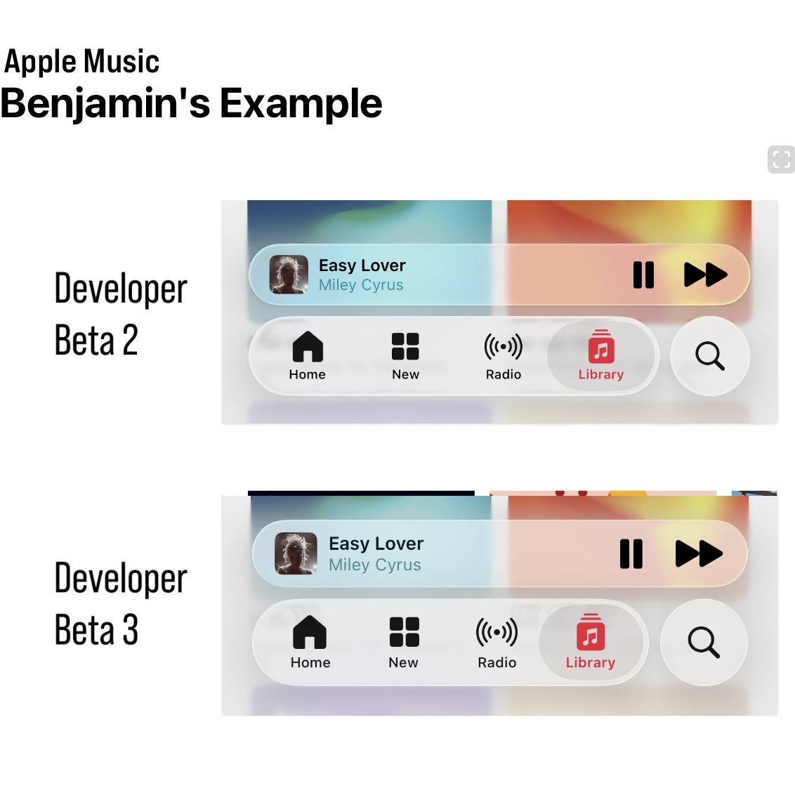
So the changes here primarily seem to focus on the navigation bar, the tab bar at bottoms of specific Apple stock apps. So in previous beta 1 and beta 2.
There was a clear transparency to the tab bar in basically every app. In Beta 3, that transparency has really, really been... toned down to the point where everything is pretty much opaque you can't really see through i don't know it depends some apps is more opaque than others yeah like the music app is a good example where it seems very opaque So I actually have my 16 Plus on the previous beta and my 14 Pro on the beta 3, right? Yep, I got comparisons too. It's not...
I think we have kind of different opinions on this. It's still on the same track, I think. Like, the HDR lighting effects have definitely been taken out. And there's a bit more... opacity opaqueness of the layer that like just makes it slightly brighter so there's like a white sheet that's been put in there right but if you actually compare it side by side in dark mode i feel like it's very similar
Yeah, dark mode hasn't changed much. In light mode, I think they've just bumped the contrast up. In other places... the bars go pretty opaque. Like Safari seems pretty dramatic too. But in music, it's not as significant as I think some people making out on like social media and stuff. Does it shine? Does it let the background shine through transparently? No, it doesn't. But...
You can still see the glass effects. It's not just a blur. You can see the refraction stuff going on. You can see the edges are lit. They have put a sheet of whiteness in there, but I don't think it's like... removed it see i think i disagree i think it can almost in a lot of cases completely removes the liquid glass effect from many of the user interface elements and i understand that
I don't think anybody would disagree that there were readability and legibility issues in Beta 1 and Beta 2. But my impression of Beta 3, and I think what disappoints me about Beta 3... is that it feels like they just threw in the towel in a lot of places. Like, you're telling me that the solution to the music app in particular was to just completely make it...
I think like 95% opaque. It's not 95% opaque. It's 95% opaque. It's not. Well, I think it is. But you're telling me that that was the solution? Like there's no middle ground, there's no other interface things you could have tried? to stick to that initial, what I think is very, very cool and fun design language, again, versus what we've landed on in beta three. So this is complicated, right? Because the material.
is very conditional based on what's behind it. So I think there are cases where they've gone too far and maybe... it's internally listed as a bug and in other places it's not like it's unclear to me whether this is the final landing spot either right like but i think everyone can agree beta 1 was too far one direction and now this is maybe slightly too far in the other direction and some people think it's even more extreme
Like if you look in the TV app, you scroll around in the TV app, the tab bar there stays pretty translucent and you see all the poster art of all the shows like fly behind it. But then you open the clock app and like the green toggles of like the alarms are like...
not seen at all through the tab bar. Like the tab obviously was very opaque in that app. And I don't really understand the difference. So I don't know if it's like meant to be that way or if it's just bugged out. I just sent you two screenshots of the music app.
Look at the bottom bars and see what you think. Because I don't think it's as dramatic as what it seems like. At least in some cases. In other cases, sure. Safari definitely seems they've made, especially in light mode, the address bar very... opaque when it's against the white when it's like black text on a white background they have bumped it up a lot
But I kind of wanted that to happen. Like the beta one situation, it looked cool, right? But you actually used the phone and you scrolled around webpages and I think it was too distracting. And so the adjustments they made, I... think are probably better overall. You're in a better landing spot. Does it completely match what they demoed in June? And what was maybe more reflective in beta 1 and beta 2?
No, but that doesn't mean it's bad, in my opinion. In many ways, you already said, like, when we did our big WWC post thing on the design, we basically put aside all the legibility problems because there was plenty of other stuff to discuss, some good and some bad, right? Yeah.
This is an attempt to address the legibility issues and mostly succeeds. And if they didn't, if they'd announced this version of the design as what they announced in June, like that was what they demoed. I still think it looks really nice. It looks really modern. Like...
The difference between 60% opacity and 80% opacity doesn't... doesn't destroy... the design in any way shape or form in my opinion in fact it makes it more practical for actually being used in the real world and you still have like even if they made every glass material completely solid right no blur no translucency
the design still looks different and pretty cool and pretty modern because you have like the search bars at the bottom the tab bars shrink as you move them around you know they're floating now they're not bars that are attached to the edges The design still looks different and they haven't completely made everything opaque there is still Translucency what I kind of get more annoyed about on this beta 3 build is that some places are really really translucent and transparent
and other places are not. So like notifications, you know, the bands that come in at the top of the screen, you can see straight through them. Like... they blur the background and they do the distortion effects but quite often if you're in like a website where you've got like a black text black text on white a notification comes in it makes like the it blurs the text behind the notification banner
But it obviously distorts it in such a... It almost looks like zebra stripes. And then it kind of overlaps with the black text of the notification bubble. So it almost makes that still hard to read. So it's very conditional based on the context, I think. The music app situation...
Yes, it is more opaque than the previous beta, but I don't think it loses the essence of it, in my opinion. I guess part of the debate here is that by default or by design, the design varies quite a bit based on what's behind it, right? So I sent you a screenshot. of a comparison in the Apple Music app between Beta 2 and Beta 3. And this is from Matt Birchler's website. And in the screenshot I sent, in those two screenshots, there's a much bigger...
difference than in the two screenshots you sent me. Yeah, and in the Matt Burscher screenshot, which now you're going to have to include chapter artwork for this stuff, so have fun. The Beta 2 version is...
beyond the legibility threshold, I would say. It's too unreadable. It is a bit unreadable, but there is a better... middle ground between what's in beta two and beta three in this specific example i don't think you can argue that yeah so in this example you could probably reduce the opacity by another 10 on beta three right and it probably okay i think this is a case where if you have the glass elements overlapping darker content it's a more dramatic change where they've made it more opaque
Whereas if you look on the screenshots I sent you, I think you would agree they're pretty close together, right? Yeah. And that's in those two specific instances. Yes. Yeah. And that's with the album art of the chill mix and the getter mix, which are like light blues and reds and oranges.
So I think whatever algorithm they use to work out what requires what amount of contrast at each spot, clearly it's not a linear change, right? It's like a... depending on what colors are behind the black text as the colors get closer to black behind the material they amplify the opaqueness i think which beta 2 and beta 1 didn't really do i mean they did it a bit but not to the same degree as they do on beta 3 but
This is a case where you look at that Matt Bertscher screenshot. Beta 2 is unacceptable. So just because it looked kind of cool, they couldn't ship that in a million years. Nowhere near good enough. Part of my other problem, too, is that they're focusing on fixing these, or quote-unquote fixing or changing this liquid glass design, while also they haven't addressed any of the...
navigational or structural issues with the design which is what bothers me more than the legibility. The example I keep coming back to is the split floating tab bars in the music app. and how you have to scroll slightly up to get that second tab bar to expand with the skip forward button. That has bothered me more throughout the beta testing process than just about any transparent liquid glass design element.
Now, I think this is still beta 3, so there's time for them to fix the navigational issues in beta 4. There's time for them to scale back the opacity in beta 4, beta 5. But Beta 3, I think, is a highly, highly disappointing Beta. And I don't want to jump to conclusions. I think my initial knee-jerk reaction was when Beta 3 came out earlier this week was extreme disappointment.
And I think it'll get better. I do think they will strike a balance. But at some point, this kind of goes back to what you were saying in our WWDC episode, Mayo, where they redesigned the phone app. and they added a toggle to let people switch back between the new phone app and the old phone app design. And you made a good point at the time, which was that. At a certain point, you have to lay your stake in the ground and pick a design.
And you have to stick to what you think is the best design. And in iOS 26 Beta 3, I think they've just given up too early and too soon and gone too far in the direction of okay. Certain commentators. don't like the liquid glass design on a principled standpoint so we are going to just throw in the towel and make everything opaque completely disagree well i figured you would right but the phone app thing and that thing is i did say that i completely believe in that
But what they ship in Beta 3 here in terms of, and we say liquid glass, but we mean the overall design, right? Including the material, right? It's still completely within the spirit of the original design. Nope, nope, nope, nope. And the example from Matt Birchler is perfect, right? They've still got the new tab bar layout. They've still got the split two rows, which I don't like either, right? When it minimizes as you scroll down.
But that is the design as it is at the moment. They haven't backtracked on that. So if they'd have backtracked on that part, would you be saying that they'd lost the spirit of the design and they just ceded to the commentators just because that's the bit that you don't like? I mean, that's a good point. Yes. Right. And would you honestly say that Beta 2 screenshot right there, they could have shipped that? In that exact form? Probably not. Well, there you go. So are they bowing down to the...
to random criticism on social media of backlash, or are they actually responding to real problems? No, but that's what I'm saying is, they needed to respond to the problems, they needed to improve the legibility, but what they've done in Beta 3 just completely goes against what I think... the point of liquid glass was, which was how transparent it was, how it adapted to the content behind you. And that's just not there in beta three. Sure. It's very faintly there, but the overall, the overall.
liquid glassification of it all has been scaled back to the point that I don't think a lot of people would notice. You want them to perfectly toe the line where it's as transparent as possible while still being legible. Yes. And they have failed to do that in beta 3. I would say they failed in beta 1 and beta 2 as well, though. Because that was too far the other side of the fence. I completely agree with what you're saying. And that is the perfect... If they can nail that situation where...
with any content background, it's perfectly legible while also bleeding through as much of the background as possible. They have achieved in the best way, right? That's the golden trophy. That's first place. But Beta 1 and Beta 2 were not there. Beta 3 is not there, but I think beta 3 is closer than the previous two betas because you have to favor legibility over visual flair. I love visual flair. I love whimsy. I love the little bits, but core navigation elements...
like the title of the song that's currently playing and the tabs, they have to stay readable at all times. And if you have to push it, if you can't get to the golden trophy situation where it's perfect, you have to compromise and be more on the side. of making it a bit more opaque, right? And remember, this is only beta 3, so they've got a long time.
where they can still tweak the algorithm even more. And I think there's a big incentive for them to go slightly overboard for Beta 3, because Beta 3 is going to be the public beta, right? Inevitably, because they're going to do the public beta in July. It's always Beta 3 in every previous year. Probably...
next week maybe right like just going off history of records beta 3 is almost always the public beta this beta feels very stable and very locked down so it feels perfect condition to be a public beta And what do they not want from a public beta? They don't want everybody to install it and then immediately complain they can't read anything. So I'm going to send you another screenshot. Just one more example. Again, for Matt Berkshler, who I'll just link his post in the show notes too.
This is the Photos app in Beta 2 versus Beta 3. Do you think there were legibility issues in Beta 2 in this specific example? Because I don't. It's not as bad as the music example, right?
which is partially due to the fact that I think there's not overlapping text, which is part of the problem with the music app in particular. Yeah, and I think if you look as to what the changes they've done to Safari, I think the reason they made that so opaque is because there's always overlapping text. So I think that's...
There is logic to the madness. It's not like everything is uniformly opaque, right? It's very conditional based on the content behind the elements. In this screenshot, I would still say the bottom one looked better. No, how? It's just a floating tab bar over faint, black, weird, mud-looking blur. The whiteness in the beta 2 screenshot above is there isn't enough contrast between...
the brightness of it and the white text. The bottom one is more distinctive. And I think you see it most in like the selected tab bar item on the left-hand side, right? Like the icon there for what tab you're on is very clearly defined in the bottom screenshot. Whereas in the top screenshot...
it's all going to blur together and be hard to discern, especially when you're looking at on the screen size of a phone, not on the laptop screen, which presumably is what you're looking at right now. And I think you look at the bottom screenshot, you can still see all of the liquid glass effects. In full play. You cannot say the bottom screen show is transparent or is not transparent. Yeah. The problem is it just looks...
Because the bottom screenshot looks like you're in dark mode because of the dark navigation bar, the dark blur behind everything. And the screenshot is not taken in dark mode. It's taken in light mode. Yeah, but even on Betty 1 and Betty 2, it would switch from light and dark depending on the content behind.
Right, but in this specific example, I think the content is roughly the same. Yes, but I mean, the problem is you can't... I could find you another screenshot, probably, comparing beta and beta 3, where...
the top one would be in dark mode and the bottom one would be in light mode. Yeah. Like it's so conditional based on... whatever parameters this clever algorithm they've got going on inside the system that you can't just like you've got to look at so many examples to get a full cross-section of the thing and i completely agree with you on the whole beta 3 is more opaque than earlier betas
That is just a fact. Because I think what they've gone for is they've looked at Beta 1 and 2. They've tried to account for as many cases as possible where the contrast ratio was not good enough. And inevitably, to fix the contrast ratio problem, you have to make it more opaque, make more distinction between the foreground and the background. I would even concede they've probably gone slightly too far and they could probably rein in a little bit.
Right? But even in this state, right, before they do any further adjustments, I still feel like this honors the spirit of the design, of the new design. And I still think it looks very new and very fresh. And if they'd announced this version in June, people would still be going, wow, this looks so cool and different.
Because it is cool and different. But it's not the version they announced in June. And it's so far different than the version they announced in June. I can fully acknowledge that what they announced in June was far in the direction of Alan Dye's... hopes and dreams and probably out of touch with reality a bit and that they knew that people working on the design knew that it was going to have to be
honed in a little bit throughout the beta testing process. I fully acknowledge that they weren't going to ship. Because they're honing it. But they've honed it too far. That's the thing. So in beta 4 they hone it back a little bit, you'll be happy again. Probably. I think they need to go... A little more than, I don't know how math works in this type of comparison, but go back closer to beta two.
than Beta 3. Like they need to go back 51% or something. If that math makes any sense. You get what I'm trying to say. I know what you mean. I don't think it's as dramatic as you think it is. I think the amount of change that they needed compared to Beta 1 was pretty significant.
And now they might have overshot slightly, but they're way closer to the end target goal. If you take the second screenshot with the photos app, I think that bottom screenshot is dead on. So if you don't like that, then you're going to be disappointed.
I think I'm prepared to be disappointed then because the Beta 2 screenshot of the Photos app looks so much better. See, I mean, this is personal preference, right? All of this is personal preference. I think the bottom screenshot... perfectly embodies what they are going for in this design and in terms of that trophy of of balancing transparency legibility and looks and style the bottom screenshot is in a really nice spot
in my opinion. So if you don't like how that looks, then maybe you're not going to be happy. But I don't think the bottom... It might not be identical to what maybe you hope, but you can't say the bottom screen looks bad, right? It still looks nice. I think it looks bad. You think it looks bad? Okay. I think it looks murky and like muddy water compared to what I think liquid glass should be and what I think Beta 2 got right in this specific example.
Well, then we're going to have to disagree, unfortunately. Well, we probably just wasted a lot of time on something that could very well be different in 10 days time. But that's the other thing you've got to remember. As much as I was withholding my complaints about...
legibility in the first two betas i feel like people who are more on the side of making it completely transparent have also got to hold their tongue a little bit just because beta 3 gone the other way right like the criticism becomes more valid when we get to the public beta. And like you said, this is all... All sides point to beta 3 being the basis. Yeah, this is probably the public beta, right? You don't have to be Sherlock to work that one out.
Basically the public beta hash chip. This is what the public beta is going to be. And now is the time where I think you can start to fairly criticize some of the decisions Apple is making. So the best comparison I've got is... the safari changes from ios 15 right where they first tried to do the compact tab bar they made sure there were a lot of changes compared to that first beta for the public beta but they carried on iterating in a pretty dramatic fashion for multiple betas after that
And the design they landed on, I think was beta six. So that was like, and it was beta three would have been the public beta. So there was three versions before they actually finalized what that looked like. So there is still a runway.
Obviously, we're talking about the future and we don't know how much they intend to change it or not. But even if they shipped what is in Beta 3 today, I would be very happy. And obviously, you're not going to be... You're going to be on the other side of that camp. But I think there's... If you want me to...
I would say there's still going to be more adjustments. And I reckon they could do adjustments for years because there's so many different parameters they can tweak to change it for the current... content that's in the foreground, the current content on the back, the type of glass, the tint of the glass.
the blur effect of the gradient that goes below it, whether there's a blur or a gradient at all, right? Like so many different facts. Like one of the things that annoys me in the Photos app is when you scroll to make the... tab bar hide right like the there's still the shadow so so you have so the the the years months and days thing goes away right so you scroll down so the tab bars in the little compact mode
right so the years months and all is no longer shown you just have the two tabs of library and collections it really annoys me that like the gradient blur is still there in the gap between the collections tab and the search tab like
I kind of wish they'd carve out a mask so it would shine through and then you could see the actual photos that are in that little gap that it's made space for. But what's going to ship for 26 is a bar that basically goes all the way across that's then a gradient blur. So, you know, there's always time for more refinement. But overall, I vastly prefer iOS 26 Beta 3 to iOS 18. Do you not prefer it to iOS 18?
To iOS 18, yes. Because I think it does look different and fresh and modern. I just don't think... It doesn't live up to the expectations Apple set. And they've gone too far in one direction. They need to course correct a bit. Because I think... Yes, Beta 3 looks better than iOS 18 did and does, but there's room for it to look a lot more better than it does right now. And we can agree to disagree on where that balance is, but I think even you would agree that there might be...
If I say they need to go back 51% closer to beta 2, I think even you could agree. Maybe they could go back 10% or 20% and just crank down the opacity a little bit more. I would agree with that. If they're in a spot where even Beta 3 you think looks better than iOS 18, then at least they're in a good foundation. Would you agree with that? That is fair. Yeah, that is fair. I don't like us when we argue, but I think it's fine. It's all a good faith.
We spend a lot less time arguing than other podcasts, I think. So I'll take it. Happy Hour this week is also sponsored by Mint Mobile. Check them out at mintmobile.com slash happy hour. You know what doesn't belong in your epic summer plans? Getting burned by your old wireless bill. With Mint Mobile, you can get the coverage and speed you're used to, but for way less money.
And for a limited time, Mint Mobile is offering three months of unlimited premium wireless service for just 15 bucks a month. So while your friends are sweating about data overages and surprise charges, you can kick back and enjoy the summer season. All plans come with high-speed data and unlimited talk and text delivered on the nation's largest 5G network. Use your own phone with any plan and port over your existing phone number. Now you tried Mint Mobile, right chance?
Indeed. And right off the bat, I appreciated just how easy it was to use the MAP Mobile website to pick my plan and complete the checkout process. I appreciated that they were super upfront and provided clear details on things like pricing, data allowances, data speeds, coverage, and all that. All the important things that you have to take into consideration when picking a carrier.
And then the actual process of activating my eSIM was super seamless with the Mint Mobile app on my iPhone. Just a few taps and I had it all set up with active service. And the quality of Mint Mobile service too has been great so far in my testing. And best of all, I'm saving over $40 a month compared to my usual plan. So yeah, like you said, Mayo, you should absolutely check out Mint Mobile and ditch your current overpriced plan.
So this year, skip breaking the sweat and breaking the bank. Get this new customer offer and your three-month unlimited wireless plan for just 15 bucks a month at mintmobile.com slash happy hour. That's mintmobile.com slash happy hour. Upfront payment of $45 required, equivalent to $15 per month. Limited time new customer offer first three months only. Speeds may slow above 35 gigabytes on the unlimited plan. Taxes and fees are extra. See Mint Mobile for details. Thanks to Mint Mobile.
for sponsoring the show. Happy Hour This Week is also brought to you by HelloFresh. It's summertime and you should do fun things and enjoy yourself when it's lovely and warm outside. And one way to help make that happen is to spend less time shopping and less time doing meal prep in the kitchen. Make your summer enjoyable and delicious by getting the number one meal kit, as voted by USA Today readers. And that's HelloFresh.
HelloFresh lets you pick your favourite recipes and have all the ingredients delivered to you. They're always curating delicious meals to choose from, like panko crusted, chimichurri barramundi, or sun-dried tomato grilled cheese sandoz. And the seasonal fresh produce and proteins travel from the farm to your doorstep along with their easy to follow recipe cards. And this summer, they're making it even easier to enjoy delicious, healthy and homemade quality meals.
with their new ready-made meal options. Ready in just three minutes, you just need to heat and eat. Now you've tried HelloFresh, right Chance? I have, and the last batch that I got included one of my all-time favorites, and that was a sausage tortellini. And like you said, Maya, one of my favorite things about HelloFresh is how you get everything you need in the box and you have a clear plan of what and how to make it. Because we've all been in that situation where we're cooking something.
Then we realized we forgot or we ran out of a crucial ingredient. And you're just left standing there questioning whether to scrap the recipe altogether, go to the store and buy what you need. And you just don't have to worry about that with HelloFresh. This time around, we got the meat, the pasta, the toppings, the sauce, all of that stuff right in the box. And of course, it all just tastes fantastic.
So for me and Emily, HelloFresh is one of our favorite things to have for dinner, and you should 100% give it a try. So make your summer enjoyable and delicious by signing up for HelloFresh at hellofresh.com slash happyhour10fm and get 10 free meals with a free item for life. hellofresh.com slash happyhour10fm One per box with added subscription. Three emails are applied as a discount on the first box. New subscribers only. Varies by plan. Thanks to HelloFresh for sponsoring the show.
Some better, some more exciting, some less controversial beta changes in Apple's other platforms. So iPadOS 26 Beta 3 has really brought what I think are more Mac-like changes to the multitasking experience. Now you can swipe between different full screen apps and your like windowed multitasking view using a four finger gesture.
Pretty similar, not identical, but pretty similar to how you swipe between spaces on the Mac, I think. I think that's the best way to explain it. It's like if you had full screen spaces and then one desktop is kind of the gist. And I think it works really well. And it's a nice simplification of a full desktop metaphor that you would get from the Mac. But on iPadOS, it feels really nice to have a place with one canvas.
which is where you can fling all your windows that aren't full screen, and then you can have full screen windows that are full screen, and you can swap between them. Obviously, the multi-finger gestures have existed on iPadOS for a long time. The first couple of betas, it was bugged, so in windowed mode.
those gestures just weren't possible to do. So some people thought they'd been removed entirely, but it was always in the documentation that it was basically a bug. And now you can see why, because they've obviously had to tweak the implementation to suit the new windowing model.
And I think it comes together really, really well. You have one defined space where you have multiple apps happening at the same time in multiple windows. And then you can do your four fingers up to enter the kind of equivalent of mission control, which is like a combination of...
the old multitasking tray where you can see a little collage of the windows that are going to be in your space then you've got all the full screen apps to the side at any time you can press the green button on app to take it to a full screen space
Or you can press the minimize button to take it out of the windowed space and just have it in like your history of apps. And then if you go back and click on it, it'll come back to the windowed space. So I think it's a really nice design. The only thing I don't really like about iPadOS multitasking is the... the amount of curvature they put on the windows, and this applies somewhat to macOS Tahoe as well, but I think it's even worse on the iPad. If you have like...
I have an iPad Pro 11-inch, right? So they make the corner radius of the windows match the display, right? Because they love the concentricity. It's one of the foundations of the new design. But concentricity at all costs has... drawbacks and like if you have four apps on screen and you do the you long press on the window controls and it will let you do the tiling options like you get on mac os
You can do four corners. It will put the apps into four corners. But the amount of curvature on the corners of the windows means in the dead center, you could almost fit like... four app icons in the gap that's there just because of the fact the corners are so rounded i just i know they want to match the corners of the screen but the amount of in setting they have to do inside the apps and then also when you put
apps next to each other, the amount of dead space there is. Especially when you've got an 11-inch iPad Pro, space does feel a bit of a premium when you're doing a load of multitasking up for Windows. It's like... Yeah, that's fair.
Is the visual symmetry of the corners, perfectly tracing the corners of the display, worth the cost? Because not only is it curving the window... itself it then has to curve all of the sidebars and all the popovers that appear in the windows all the buttons to the same amount to make them match so if you add less curvature on the outside you just have less curvature on the inside so
they're obviously going forward to make it match the window corners and it does look nice but there is a practicality argument it's like you could just curve them slightly less you know and it wouldn't perfectly nestle into the corners of the screen but it would then actually let you use the screen a bit better
I'll just say big picture on iPadOS 26 is that I have tried many times to just throw as much possible at it to try and get it to break down, to try and get it to revert to the classic frustrating iPad experience.
And that's just not possible. It is incredibly robust and incredibly versatile in a way that I don't think I expected, and I don't think a lot of iPad Power users expected. I think at this point, kind of like we said a few weeks ago, Where iPadOS falls down are places now entirely due to system limitations and things like not being able to have a clipboard manager, not being able to use something like TextExpander.
those inherent limitations of iPadOS as a platform, not the multitasking and the interface of using the iPad. Yeah, the windowing system feels really solid now. I've been super impressed with it. And then also on iPadOS 26 Beta 3, they've added the feature on the Mac where you shake your cursor really fast and it gets big so you can find it. You can now do that on the iPad as well. So another Mac-like touch. Oh, that's cute. Yeah, I don't use my iPad with a trackpad.
Because I just have a basic case that just does like, it's kind of like a, you know, what do they call them? It's like the smart cover, but it also has the back bit. It's some unbranded one, but it works well enough. So it doesn't have a keyboard or a trackpad attached to it. So I just type on the glass using my fingers. So I'd notice the cursor details like that. But yeah, that is cute. Then macOS Tahoe 26 Beta 3. There is a new Lake Tahoe inspired wallpaper.
Looks nice, I guess. I guess it's one of the... Do they call them Ariel on macOS? That's a good question. Landscape is what they're called, apparently. But it has the animated thing on the lock screen where you unlock your Mac and then it kind of slows down, goes into a still image for your Mac's wallpaper. It's nice, but I'll reiterate what I've said on this show before where...
it looks blurry on the Pro Display XDR. It just doesn't look as sharp and crisp as I think it should. It's because they're like 4K videos, not 6K videos. Yep, exactly. Then I installed, so yeah, speaking of that, I installed Tahoe on my main Mac this week. I think overall it's good, and there are things that people were upset about that they're rightfully upset about that I haven't noticed.
the transparent menu bar, maybe it's because my default Mac wallpaper is like black at the top. So even on Sequoia, it was kind of transparent. Like you couldn't really make out the menu bar. So this completely transparent menu bar or the non-existent menu bar in Tahoe hasn't bothered me at all. And I don't even really notice it. What color is it? Use your wallpaper. Is it light or dark? When? Right now? Yeah.
Sorry, I should clarify, I guess. Right now on Tahoe, I'm using the Tahoe wallpaper. Okay. So it's probably quite bright sun-like sky. Yes, it's blue. It's the sky, yeah. So it is not... Despite how they announced, it is not completely transparent menu bar. They put a gradient effect on there. So if you look, there's a black shade that disappears. Oh, yeah. It is there.
I think they changed the opacity of it depending on the background color. But it's not a completely bare menu bar. They do put a background on it. And if you use that setting, which toggles to the show menu by background, if you just toggle that one off a few times, you'll see the straight line color goes away, but you see the gradient appear. So they definitely do put a gradient treatment on it, but I have no problems with it.
quote unquote transparent menu bar because I think it looks nice. Again, it does depend on your wallpaper, right? Because if you have a super busy wallpaper, like a super deep texture, a pattern thing, it probably would...
mess with text legibility but most people's wallpapers if they're like a picture of their family they generally have like sky at the top of the screen so it's generally quite flat colours where the menu bar is and then the details like in the centre so I think in most cases it kind of works One thing I noticed and was kind of surprised by is the animations in Tahoe, like throughout the system, like when you open notification center on the side, when you open a new window.
When you just kind of play around in the Messages app and things bounce around a little bit, all of those animations feel a lot smoother. And I say that, again, using the Pro Display XDR, which is just a 60 hertz screen. So it's not like ProMotion making the animations look smoother. It's just something they did to maybe the animation engine or something to make things act like they're less janky and less laggy. And maybe that's because some of the animations are definitely slower.
I'm pretty sure the animation to open notification center is slightly slower than it was before. The animation to open control center kind of like has more of a fade in and that looks great and it looks incredibly smooth. Something I didn't expect when I installed Tahoe. Yeah, animations on the Mac have never been as buttery smooth as iOS. So they could have very easily done like some behind the scenes implementation change to how they render stuff or maybe more of it.
is now swift ui powered which uses a different animation engine right so maybe that has maybe that's what you're perceiving just in terms of being less juddery uh But yeah, I'm all down for smoother animations. What do you think about the toolbar treatment in Tahoe? Because that's the thing that really kind of puts me off the design on Tahoe. Like the really heavy drop shadows on like the floating elements in like the top bars.
I just can't get along with it. It just feels very imposing for what should be like, you know, if you want the con, if you want, if the idea is to get the Chrome out of the way for the content, these feel like very in your face elements, in my opinion. So give me an example of where to look. So like if you have Safari open and the way that you have like the back and forward buttons aren't like now in one continuous bar, they kind of float on their own in a little like pill shape. Yeah.
i just find like the amount of drop shadow and it just the layering doesn't make sense in my head right like you have the sidebar which has some amount of blur and some amount of shadow And then you have the top bar elements that feel very prominent. Like a finder window, right? Where you have like the different list options, the different view options. It just feels very in your face. Whereas you look at the older Sonoma design and...
Those elements didn't even have borders, right? Until you hovered over them. Whereas now they're like thick borders, big shadows. I just can't really get along with that. No, I can see that criticism. It doesn't bother me that much.
makes it for better for worse it kind of makes it clearer what's a button and what's just an interface element sure yeah because i think you could look specifically at say the finder interface in sequoia and you have those two arrows and in that specific scenario it's pretty obvious that the two arrows one's back one's forward but there are plenty of interface elements throughout mac os over the years that have lost their distinguishing
button design and they just look like icons and I think Tahoe solves that in a lot of places it definitely goes in the other direction yeah A bit like your liquid gas discussion from earlier. I kind of feel like they could tame it back a little bit. The amount of shadowing on some of those controls, on those top bars, is pretty extreme. So much that it distracts my eye.
I mean, I could get along with it, but I just don't think the implementation of the new design on the Mac is as well finished as it is on iOS and iPad. And to be honest, the way the toolbar treatment works on the iPad is very similar to the Mac. I don't know why it annoys me a lot more on the Mac than it does on the iPad. I'm not sure. I still haven't worked that out in my brain. Probably familiarity to a degree. Yeah, maybe partly familiarity. But also I think it's like on the iPad...
I know you've got the new Windows system, but a lot of time you're doing full screen apps one at a time and you kind of need the bigger touch targets for the fingers, whereas you've more got mouse input. There's some combination of those kind of factors that just makes it feel slightly worse to me.
The music app in Tahoe is surprisingly good. I think it's got a new skin on it, but it's very clear. It's still the same iTunes design or iTunes structure under the hood, but the new design is nice. I think it's... Far more similar to the Apple Music experience you are familiar with on the iPad and the iPhone, with the bottom floating design. The one thing I wish is that there's no sort of liquid glassification.
really, of the sidebar in the music app. But if you open other certain apps on the Mac, like Mail or even Podcast is kind of an example, that sidebar does reflect both what's underneath it and kind of what's next to it. to a degree. And that's just not there in the music app. But usability and functionality-wise, the new music app, I think, is pretty good. Yeah, I don't have Tahu on my main machine still. I just run it in a VM for now.
I'm mostly happy with it. Yeah. It's probably my least favorite version of the design compared to the other platforms. But it's not horrible, you know. I like that I can see backgrounds and messages now.
because I had them on my phone and my iPad, but I couldn't see them when I came to the Mac, and the Messages app just felt boring, but now they're all there. Have you tried the new Spotlight? I have some. I just installed this on Tuesday, so I haven't had a whole lot of time to truly get into it. But right off the bat, it's faster. That's the first thing you notice is that it's so much faster when you're searching for something. Because the old Spotlight, I think...
I don't know if it was just years of cruft that it built up or what, but there would be so many times when I would search for something like specifically like a file and it would just like not find anything, which was so frustrating. But now it's.
so much faster and easier to find what you're looking for i need to dive into like some of like the s like the example they showed during the keynote like the sm to send a message or whatever to craft a whole email via spotlight i need to dive into some of that integration stuff yeah
I need to try some of that more. I think the quick keys, like SM stuff, you have to manually turn those on. I don't think it has them built in. I could be wrong about that, but I think you make... you can access all the shortcut actions by using text so like if you say like mail or message it will like find the message shortcut actions but if you want to assign them to like individual letters i think you have to do that yourself
yeah it looks that way i don't know i'll play with it more but yeah but yeah i'm excited to use new spotlight because it's definitely a big step up finding this week happy hour is sponsored by oracle in business they say you can have better cheaper or faster
but you only get to pick two. Well, what if you get up all three at the same time? And that's exactly what Cohere, Thomson Reuters and Specialized Bikes have since they upgraded to the next generation of the cloud, Oracle Cloud Infrastructure.
OCI is the blazing fast platform for your infrastructure, database, application development and AI needs, where you can run any workload in a high availability, consistently high performance environment and spend less than you would with other clouds. How is it faster? OCI block storage gives you more operations per second. Cheaper? OCI costs up to 50% less for compute, 70% less for storage, and 80% less for networking. And better?
Well, in test after test, OCI customers report lower latency and higher bandwidth versus other clouds. This is the cloud built for AI and all your biggest workloads. Right now, with zero commitment, try OCI for free. slash happy hour. That's oracle.com slash happy hour. Thanks to Oracle for sponsoring the show.
No, I don't want my watch battery life to be any worse than it already is. Okay, I was having battery problems on Beta 1 and Beta 2. So far, Beta 3, it's like back to normal. I might give it a shot then. Yeah. There's not loads of stuff new in the watch bar yet, but everything that I've changed, I'm pretty happy with it. And they've changed more in Beta 3, you said? Yeah, yeah. So we spoke about the control center a couple of weeks ago, where...
At least on the smaller watch, and I have the small watch, right? The control center elements, when they were lit up, the light would reflect off the... the neighboring elements in the rows so like if you had the bedtime focus mode on which is like a blue color you'd see bits of the blue reflection in the edges of the battery widget that's next to it, or if you had like Wi-Fi turned on or like the mute orange that would like light up the colors next to it. And it was so close together.
Like maybe if you have like a if it was if you look at it for like once It's like oh that looks kind of cool where the light kind of bounces off each other But if you're day in day out just trying to go on to this like
1.5 inch watch screen you know that's down by your side and you look at everything just kind of like muddies together and it was kind of overwhelming well i'm glad to report that in beta 3 there are no more edge lighting effects so they've just taken them out it's they've tamed down
The Disco Inferno. And now you still get the kind of like translucency compared to what's on the background. But if a control center toggle is lit up, there's no influence on the stuff on the side. Maybe you can make an argument that doesn't honor the...
spirit of the design or whatever but i promise you it's better again i'm not running it but in the screenshots you've sent it definitely does look better the disco inferno as you called it was it was too much it was too distracting with the colorful elements behind Yeah, and control center on the iPhone never did that, right? Like even on Bay 1 on iOS 26, if you had an illuminated control center element, it didn't refract off the stuff next to it. It was always based on the background effect.
and so now the watch matches they also have a nice new look for the pin code entry screen so you know when you like put your watch on and you haven't unlocked your phone first so you've got to type in your pin code
The previous incarnations, they were like these square rectangles, right? For the one to nine buttons. Now they're like little circular pills. So it looks more like the phone lock screen. It just looks better. You know, you get some slight glass effects too, but it just mostly just looks nicer. And I see it every morning because I generally end up putting my watch on. I don't really understand how this works, but like I'm using my phone and then I guess I lock my phone.
and then I put my watch on so therefore the watch hasn't unlocked because it hasn't been on my wrist when the phone was unlocked and then I pick up my phone and I leave the room and then it's like oh I need to put my pin code in but quite a lot of the time I'm into my pin code on my watch and now it just looks prettier so I'm happy about that because the old pin code just kind of looked
It kind of looked a bit dated on watchOS 11, but even on watchOS 26, before they did this version, it also looked out of place and now it looks very modern. And then finally, responding to a complaint that I brought up on the show about the workout app.
how they redesigned it in beta 1 and beta 2 where like the the flowing list of workouts is gone and it was basically it was page it was paginated right so one page was one workout and you just scroll a whole page worth to get to the next workout in the list more like the
The way the weather app works, right, where it's like section pages or like the activity app where you go like page by page by page for each ring. The workout app, if you have a lot of workouts, there was a lot of scrolling you had to do on beta 1 and beta 2 to actually get through the list.
Because you could have 10 workouts and you have to scroll through all of them. One by one by one by one. In beta 3... they haven't gone back to a traditional list but it's closer like you can now scroll freely and like more workouts show at the same time and then when you let go that one workout kind of fills the screen so if you have a lot of work different workout types you can flick through them a lot faster
I still don't love the redesign because the big thing they've taken away, and this doesn't change on beta 3, is if you have like a workout with a goal that you do all the time on earlier versions of watchOS. it would remember that. So I do like a 30-minute walk, right? It would keep that in the list as like a yellow tile, right? Because the yellow is associated with the time limit. And so every time you could just one tap on...
the workout on the walk that's yellow and it would do a 30 minute walk all of that is gone everything's always green now which means open goal you have if you want to set a time limit you always have to do like the timer button in the top right and then click on goals and then click on time I just I want them to make it so you can like pin your set goals to the main screen and you used to be able to do it and now you can't anymore yeah that sounds like a regression
I think it is a reaction that most people just do open goal workouts. So that should be the common case. But they should let you pin a custom workout configuration. Just like you can pin in the music app now. Pinning is in, so they should add it to the workouts app too. Then last but not least this week. Executive changes at Apple. They need to pin their executive team down. Yeah, they're getting too old. That's the problem. Jeff Williams, Apple's chief operating officer, is stepping down.
And what Apple says is a long planned succession that will occur over the next year or so. Williams will hand over COO responsibilities to Sabi Khan, Apple's... What is he now? Apple's vice president of operations. So he will become COO this month. Then Williams will formally retire at the end of the year. And at that time, his other responsibilities.
will be handed off. So he currently also oversees Apple Watch and Apple Health, as well as design. So we don't exactly know who is going to take over watch and health. We'll talk about that in a minute. But design is going... So the design team will report directly to Apple CEO Tim Cook. This is interesting because Williams, he took some responsibility of the design team in 2019 when Johnny Ive left to start Love From.
And at the time, Apple specifically said that Evans Henke, who was VP of Industrial Design, then Alan Dye, who was VP of Human Interface Design, would report directly to Williams. Then Henke, she left in 2023. And in conjunction with that, Apple eliminated the head kind of industrial design chief role altogether and shifted full responsibility for the core of Apple's industrial design team to Williams.
yeah there is an there is like a evans hanky replacement called molly anderson i believe um but it's definitely like i think evans hanky had like was like the old johnny ive kind of didn't have the same title but like she was the boss right And now it's more like you have Alan Dye and Molly Anderson running side by side for hardware and software. And they were previously reporting to Williams. And now they're no longer reporting to Williams. They're reporting directly to Tim Cook, who has...
On the record, probably said he's not much of a product guy. It's interesting. I mean, the knee-jerk reaction to this is to say, oh, great, the operations CEO, who's not a product guy, is now in charge of design. It's certainly a bit disconcerting that they haven't made any real changes to the structure of the design team since Johnny Ive and Evans Hanke left. But I don't think you could say, at least under Jeff Williams' leadership, that design suffered.
I mean, I just think Jeff Williams, you know, he contributed, but he mostly let the design team do what they want, right? Like, it's not like, if you're not, that's why, I think they even say in this press release, right? What's the word they use? Oversee. right yeah yeah it's not run it's not lead it's oversee right so they let the design team make the choices they want to make and he has some input and they have a back and forth right but it's an oversight it's not a leadership position
I think it's insane that Apple, the company known for design on all facets, does not even superficially name somebody to the leadership page that has a title of design, right? We had this discussion when Johnny Ive left too. When they did Johnny Ives' first attempt at retirement, which was what, around 2016, 2017, and he became chief design officer, they put two people on the leadership page.
to represent software and hardware. Alan Dye was one, and then Richard Haworth was the other one, right? Oh, yeah. Then when Johnny Ive changed... seemed to have a change of heart and like take over properly they got rid of those two from the page and it was just johnny ivan in head of design right and then he finally actually went out the door around 2019 and they just got rid of all references to all design on the page all together
I don't care whether titles matter, whether it's symbolic or not. I just think it's a bad look that the apple.com slash leadership page has no reference to design. at all not in the svp tier not in the vp tier right
Look, I've got nothing wrong with China and stuff, right? But on the VP, on the Libetri page, they will name the Vice President and Managed Director of Greater China. They will manner the Vice President of the Corporate Services. They name the Vice President of Worldwide Sales. They name the Vice President of Marketing.
Even if you don't want to give someone an SVP role, just put the VPs in the net. Put Alan Dye on this page. It'll at least make it seem a lot more harmonious. It just seems like you're fueling the flames. of the worst narrative where it's like Apple doesn't care about design anymore. They're just an operations company. You know, they won't even put a face on the page that represents design. I don't understand it. It's interesting too that in the press release, like...
Wouldn't you think the natural succession would be that Sabi Khan would take over design if that was what Jeff Williams was doing? And he would also take over health and Apple Watch? I think, and it's hard to know, right? Because these people are pretty secretive. But I think Jeff Williams had more of a product bent than Sabi Khan does. That's what I was going to say, because then...
Mark Gurman did a story where he talked to some of the people who previously reported and worked to Williams. And there's a quote from Meow Cha who reported to Williams in the health group. they said that Sabi is very much cut from the Tim Cook cloth while Jeff was a little more product-minded. Sabi is just a really brilliant operator and methodical in the same way that Tim would operate. You know that, um...
uh that like classic anecdote where like tim cook's having a meeting and then something's going wrong in china and he's like okay deal with it and then five minutes later he's like why are you still here yeah yep sabi khan's the guy that he was saying why are you still here too
Oh, I guess so, yeah. Yeah. So they're definitely cut from the same cloth, you know. Like, Jeff Williams was a big proponent of the Apple Watch, right, from the beginning. He did a lot of the work on that, a lot of the led the product on that. I just don't think Sabi Khan has that in his special skills. He's much more of the Tim Cook kind of person, and that's why he's not getting the responsibilities of the watch team, the health team, and design. Now, why is Tim Cook getting the...
The Diet Report for design. They're cut from the same cloth. Yeah. I guess he is the CEO, so ultimately everything's stuck with him. And they don't have a better person to do it with, I guess. This is the funniest thing about this pressure list, right? They're like, long planned succession. And then the best they can come up with is design team reports direct to CEO, health and watch, we don't know. Yeah. It was insane that it was written like that.
I don't doubt that it was a long planned transition because obviously a company as big as Apple has these transitions planned a decade plus in advance. That's why they promoted Sabi Khan six or seven years ago. That was clearly planned, but the announcement of this definitely feels a little bit rushed. I think Williams had indicated that he wanted to retire probably a few years ago. They've got the chairs in order to take over the operations department.
which is very relevant at the moment with all the, you know, getting manufacturing diversified out of China, et cetera, et cetera. I think they even mentioned like Apple's efforts to do advanced manufacturing in the US is one of the specons. domains, right? Like directly in this press release. So they're very of the time. And clearly they had that part of the succession plan perfectly set up so Sabi Khan can take over. The product stuff is just a lot more...
I mean, what did they used to have? They used to have product marketing as an SVP role with Greg Joswiak, right? Mm-hmm. Now they kind of had worldwide marketing with... Sorry, they used to have product marketing with Phil Schiller. Right? And I think Phil Schiller was pretty involved in the products. That position is now worldwide marketing with Greg Joswiak. I don't know if he's against Joswiak, but it doesn't feel like he's as product-focused.
as maybe like Schiller was, right? Like I feel like if Schiller was still around, they would have like the design team report to Schiller, you know, before the CEO. I don't love that it feels like the CEO's just like, well, we don't have anyone else to report to, so I guess it'll have to be the boss, you know? Because this whole tower of cards...
Tim Cook's got more reports than ever, direct reports than ever before. He's going to retire soon, right? That's the thing, yeah. You know, within five years, I think it's pretty likely Tim Cook will... you know he might not leave the company but he'd probably leave the ceo role and go to like chairman of the board or something right and now jeff williams is out of the picture
The only option is going to be John Ternus, right? As German's reported for many, many, many years. Everyone else on this ball or everyone else on the SVP level is too old. That doesn't matter about their skill sets or their ambition or their interest. They're just too old. I saw some... Person doing an editorial about how Deirdre O'Brien could take over. I think Deirdre O'Brien has pretty good skill sets to replace him for a CEO, right?
And clearly she's been at Apple for a long time. She's dedicated. Tim Cook obviously likes her. They come in at different moments. She's moved around and handled retail and people and retail and people. There's been no shuffles. She's just too old to take over as CEO. She's like 60. And Tim Cook's what, like 64? And John Ternus is in his 40s? Yeah, I think he's 50 this year. Right, yeah, right at 50. So even John Ternus isn't super young, but he's got...
Let's say he takes over in two years' time. That gives him, what, 15 years' runway to be CEO before he's like 65-ish, you know? Like, that sets Apple up for a good decade and a half. Anyone else on this page is just too old. Why go through the tumult and the churn of naming somebody else when they're going to retire too in the not-so-distant future? Jeff Williams was obviously the... you know the backup plan right if tim cook died five years ago jeff williams would take over
But that didn't happen, thankfully. And now they're obviously going for the next generation of leadership. And that has to be John Ternus. Just look at the page. I know Gehrman's reported it. But even if you didn't have Gehrman's insight on this, you can just look at the ages of the people on the website.
The only person that could even fit the character is John Ternus. And do I think Apple's going to hire from outside? No way at all. Nope. So John Ternus is going to be it. It's just a matter of when Tim Cook wants to hang it up. The timing of all of this is interesting, though, for several reasons. So we had Luca Maestri retire. So that's another thing. So first, did you notice that in Phil Schiller and Luca Maestri is like. Transition press release. Neither of them said retire.
But Jeff Williams specifically calls that retiring. Whether or not that means anything, I don't know. But I thought it was interesting. I think that it was because Maestri and Schiller are still named on the leadership page, right? Because Maestri runs corporate services doing...
but clearly a smaller role than what he used to do as CFO. And Schiller runs the App Store. Last we heard from Schiller is he's working 80 hours a week defending the App Store. Yeah, an incredibly fun retirement process, right?
But I think the reason they use the word retirement for Jeff Williams is he's not going to be on this page because he's literally going to leave. It's a clean cut. Yeah. Clean break. Yeah. He's not getting transitioned to a role in the sky. He's literally leaving. So we had Luca Mastri. stepped down as CFO earlier this year. Now we have Jeff Williams stepping down as COO, which I'm surprised those transitions are both happening in the same year, honestly. The anecdote going around is that...
Tim Cook had hoped to retire sooner, but Trump won, and he's good, or at least was good, at dealing with Donald Trump. So he was at least locked in as CEO until 2020, whatever, 2028. If Trump had lost, it's... it's possible to imagine that Tim Cook had stepped down in between Luca Mastri and Jeff Williams. Because I think transitioning those two key roles, then doing the CEO, wouldn't it make more sense to do CFO?
You get that guy settled. You transition. Tim Cook retires or he transitions to board of directors. But you say, okay, Jeff Williams is cut from the same cloth. He'll help John Ternus get on his feet and get going. Then you have Jeff Williams retire. In my mind, that would have made more logical sense than the current timeline as it played out. Maybe. Who knows, right?
If you want a conspiracy theory, I feel like the Williams thing is kind of on point, right? He was probably always going to retire about now and they've set it up for a long time. I think Maestri might have been pushed out, maybe? I mean...
There are all those stories about him not giving the budget to the AI team, right? When they probably should have given the budget. So if you want a short-term reason, maybe that's involved. I don't know. Maestri hasn't been there as long as many of the others either, right? It was a relatively recent addition to the...
So I kind of feel like his departure was more unexpected for the board than Williams's was. There were two anecdotes about Maestri shooting down ideas. It was the AI stuff, which Apple kind of refuted. and said that they didn't give the AI team all of the money at once, but they gave it to them over time, which is still not a great look because you need the money to get going. There's a high startup budget required for a lot of these AI things.
And a part shortage, so ideally you want to lock stuff up as soon as possible. And there was something else that I thought he overruled Tim Cook on, and I can't remember what it was. That was the discussion about the 27% cut, right? Oh, that's right. Yes. There was supposed to be the meeting where Phil Schiller was arguing for like zero and Maysher was arguing for 27%. This is the EU thing with the link outs to the app store, the link outs to the web. And Tim Cook sided with Maestri, right?
Yeah, this was the US Epic Games case because I remember the judge was like, Tim chose wrong or whatever. So yeah, it's, yeah, it's, there is certainly some evidence. They took the fall for that. I think the Tim Cook thing, he indicated around 2020 that he wouldn't be at Apple in 10 years time, right? So I kind of feel like sometime this decade has always been on the cards. Yeah.
Does the Trump presidency change things? Maybe a bit, but I also feel like he could manage that relationship being chairman and someone else to get named CEO and he could, you know, he'd be the Apple fellow for the presidential relations department for another five years. I don't think it...
I think they probably just want a few more years to train Turner's up before Tim Cook steps down. I think Tim Cook likes his job, right? Yeah, I can't imagine why. I don't think Tim Cook's going to quote-unquote retire. He's going to... go upwards to be a chairman, right? Williams wanted out and they've made that as smoothly as possible.
I am excited to see some of this changing of the guard start to occur because we haven't had much turnover in Apple's executive team in a long, long time because they're old and they've been there for a long time. It doesn't sound like Sabi Khan taking over as chief operating officer will lead to much. Maybe if some of the bad things we've heard about Luca Maestri are true, then maybe Kevin Parika taking that over will lead to some interesting changes.
But can you imagine Apple when you put a hardware guy, a product hardware guy like John Tarnas in the CEO role? That's exciting. And I think Tim Cook is an excellent CEO. I have nothing but respect for Tim Cook. But can you imagine putting John Ternus, the guy leading the team at Apple right now, who has the team that has just excelled at like every single thing they've done in the past? I mean, it's the closest you get to the Steve Jobs run company. Yeah, exactly.
And maybe John Ternus comes in and he says, OK, we do need a VP, a senior vice president or whatever of design. We need to adjust the organization to give that design focus, to give a better semblance that we're still. A hardware, software company. A product company. It is a bit curious they didn't make the design team report to Ternus then, right? Well, Gurman says that Ternus got the watch a year ago.
And they didn't even mention that in the press release. But, I mean, they said the design team goes to Cook, right? Right, yeah. It might have made more narrative sense if they went to Turnus, right? Because, I mean, that includes industrial design, includes software design. Normally it goes into the hardware of the products, right?
It's an odd one. It's an odd one. But I feel like the Jeff Williams transition in isolation was handled as well as it could be. It's just the rest of the structure of the company is a bit in flux. Which is why I think this is so interesting because I'm sure we talked about Luca Mastri retiring.
And we didn't have a whole lot to say about it, but I feel like there is more to say about the Jeff Williams transition. Just because, again, A, he was the, if Tim Cook hits by a bus, Jeff Williams is CEO the next day. And B, there are a lot of moving parts. And he did have more of a product influence than I think some people gave him credit for. Interesting times ahead.
All right, I think that does it for this week. You can find us on Apple Podcasts where you can leave a rating and a review. Find an ad-free version of the show with bonus content each and every week at 9to5mac.com slash join. for $5 a month or $50 a year. Send us feedback, happyhour at 9to5mac.com. I am on threads and elsewhere at Chance H. Miller. And Mayo, what about you? At BZA Mayo. All right. Thanks, Mayo. Bye-bye. Hold on. Give me one second. I'll give you one second.